La fecha y la hora ya habían llegado y caminando dimos con el lugar que parecía un poco escondido, dudé por un momento si estaba en la dirección correcta pero después de preguntar me dijeron, sí aquí es lo de Shit Robot, sólo me sonreí para adentro, debo admitirlo, estaba emocionada.

Cuando entré al lugar ya estaban Sequencers mezclando y en los visuales Sucio Frames. No había mucha gente pero sí pintaba para buena la fiesta, ya saben, entre modernos, chicas ¨vintage¨, gente que sabe y gente que no ubica ni una pizca de música electrónica y eso sí muchas cámaras fotográficas, quien estuvo ahí no lo podrá negar.

Yo me senté junto a mi acompañante y recuerdo que los ventiladores dentro del lugar me incomodaban un poco, pero pensé que seguramente cuando llegara Marcus Lambkin (Shit Robot) el calor se pondría bueno y me olvidaría del aire artificial.

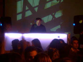
Después de un par de tragos, una amena charla y ver como se iba llenando el bar entre conocidos y no, apareció ¨la estrella¨ de la noche, con su maletita negra UDG que es emblema de un dj, uno de verdad, uno de vinyles con el que se puede gozar de los sonidos que salen de los surcos que van directo a la aguja.

Ya lo he pensado varias veces y nunca causa tanto revuelo un dj como el vocalista de una banda y eso lo confirmé después de que a su llegada, sólo los promotores se acercaron a él e intercambiaban algunas palabras, al poco tiempo se mezclaba entre la gente, ya traía un cigarro y una bebida en la mano mientras mostraba un semblante serio y si no fuera por su par de vans, hasta diría que formal. Le dije a mi acompañante ¨él viene a lo que viene¨.

Y a ¿qué iba? A armar una fiestota (y según mi opinión lo logró). Se subió al pequeño escenario, los visuales se pusieron mejores y la charla de mi acompañante y mía se terminó, ¨vámonos a bailar¨ le dije.

Su aspecto había cambiado por completo y ahora él era el dueño de la fiesta, como lo hace un buen dj, que no necesita acoplarse al cotorreo si no que él provoca que la gente se acople a su set, donde un neoyorquino que debutó en 2006 conocía perfectamente las sensaciones de un público tapatío, en donde a la gente que le gusta la buena música electrónica es poca, pero que al final los que lo disfrutamos lo hacemos más porque nos sabemos pocos.

La fiesta se desenvolvió en un set que comenzó sonando muy a Shit Robot así como a toda la tendencia de estilo que ha marcado una de las disqueras más representativas del movimiento ¨dance independiente¨: DFA records, luego de forma natural la velocidad se fue acrecentando avanzando desde el electro hasta el Techno. Desde mi punto de vista sin perder su esencia.

Lo que sí de plano se me hizo innecesario fueron las ¨guapas¨ que se subieron a bailar arriba del escenario y que yo qué sé, pero tal vez ni ubicaban quién estaba tocando. Otra cosa que no me gustó, fue que uno de los patrocinadores llamaba tanto la atención que de repente se armaba más ambiente gritando que se tomaran un shot, que presenciar el magnífico desempeño de quien es uno de mis dj´s favoritos.

De cualquier forma quedé satisfecha y gustosa de poder asistir y por una vez agradecí que el disco esté tan de moda.

Verónica Rodríguez.

¿En qué momento de la historia nos convertimos en seres tan indiferentes? Si creemos, porque no están atacando a mi credo. Si no creo, porque no me interesa que a otros les destruyan un sitio sagrado. De igual manera, no me importa.

No pretendo justificar las atrocidades que los gobernantes realizan, las traiciones a la gente y la falta total de compromiso con aquellos por los que deberían trabajar: la ciudadanía. Pero me cuesta aceptar que los mismos que a diario nos quejamos de los problemas que nos afectan, seamos tan indiferentes a los problemas de otros. Problemas serios y graves.
Recuerdo que cuando estaba en la primaria, en mis deficientes clases de historia, todos los temas giraban en torno a las batallas perdidas, los héroes caídos y una larga tradición de recordar todo eso que México “ha perdido”. Con el tiempo me fui preguntando a mí misma, ¿qué debieron haber sentido los indígenas mexicanos cuando llegaron los españoles? Cómo habrán reaccionado al ver que sus templos, casas y familias, eran destruidas porque así lo habían decidido otros que no tenían ningún poder sobre ellos. Cuando leía historias relacionadas, me imaginaba la impotencia y las ganas de querer morir, antes de ver cómo el mundo que te rodea se esfumaba en manos de personas que lo único que buscaban era ganar. Oro, poder, mujeres, territorio, la idea era quitarle a un país de “raros” cualquier noción de propiedad y adueñarse de todos. Total, decían que eran seres “inferiores” porque hablaban con palabras que no se entendía, porque vestían distinto, se alimentaban de otras cosas y creían en dioses que no

eran Jesús. Una iglesia católica obsesionada con acrecentar su poder y tachar de bestia a todos los que no creyeran lo mismo; que veían en la diferencia de creencia, un problema urgente cuya única solución era la conversión a la fuerza y sin preguntar. Así me lo pintaban en la infancia, así lo creí y así me obsesioné con esa horrible idea de sufrimiento.

14 o 15 años después, me paralizo al estar viviendo una situación igual, pero con alrededor de 500 años de diferencia. Los wixaritari están a punto de presenciar cómo los habitantes del país del que son parte, se cruzan de brazos mientras el gobierno le entrega a una compañía canadiense, el derecho (que no tiene) a explotar un sitio que representa uno de los lugares físicos en los que se basan sus creencias.
No sólo se está dañando la base de una cultura que por siglos ha luchado para mantenerse de pie, luchando contra adversidades físicas y sociales, se está dañando también una forma de pensamiento que todavía depende de ese otro aspecto que al humano le es indiferente, pero sin el cual no podría vivir: la naturaleza. Incluso se está dañando a poblaciones cercanas que no piensan en nada más que en encontrar una fuente de trabajo, a costa de lo que sea y bajo las condiciones que les den. Los wixaritari, en su mayoría, no están ubicados en las cercanías de Wirikuta; la mayor parte de sus comunidades están en terrenos de alta montaña. Lugares a los que se han ido porque las condiciones a través de los años así los han orillado, ellos buscan vivir en armonía con la naturaleza, trabajan bajo sus parámetros de no explotación natural, no gastan ni la décima parte de agua que usted o yo usamos sólo al bañarnos bajo las cómodas regaderas de nuestras casas. Celebran que la tierra les entregue los frutos que merecen y saben aceptar la sequía, asumiendo la responsabilidad de que quizá no fueron buenos con la madre tierra durante ese año. Cuidan gran parte de los recursos naturales que a nadie de nosotros le importan cuando subimos a un auto, pero que con gusto todos disfrutamos en la vida diaria.
¿Sabe a cambio de qué lo hacen? A cambio de nada. Lo hacen porque en eso creen. Así como muchos creen en un trabajo bien remunerado que les permita tener bienes materiales; así como otros creen que tener poder sobre otros los hace mejores; como los religiosos creen en sus santos y en sus dioses; así como cada persona es libre de creer en lo que quiera, en nada, si es que así lo desea. ¿Pero sabe qué no es justo? Que cada persona en este país esté tan dentro de su mundo individualista, que se vuelva indiferente a las injusticias ajenas. Peor aún, que seamos parte del problema y nos quejemos de eso.
Si estuvieran a punto de derrumbar la catedral metropolitana, los católicos (incluido gran parte del gobierno) estarían armando un escándalo. A quién trato de engañar, ni siquiera habría sido posible que alguien intentara derrumbarla. Los detractores, harían chistes al respecto y dirían estar de acuerdo en que ocurriera; positiva o negativamente, le darían atención. ¿Cuál es la diferencia? ¿Que los wixaritari son pocos? ¿Que no les inventaron deformaciones en sus palabras para después decir que predijeron el fin del mundo (porque los mayas no predijeron el fin del mundo) y por eso no son “famosos”? ¿Que no hay muchos turistas que visiten la zona de Wirikuta? ¿O simplemente se debe a que, al no representar un gran sector de la población, no existen?

¿En verdad podemos ser tan ausentes a este tipo de acciones? La vida no gira en torno a nuestras vidas y los nuestros, no son los únicos problemas. A diario, en todo el mundo, hay personas que están luchando por salvar lo poco valioso que les queda en sus vidas, las situaciones son muchas y muy distintas. Yo todavía sigo admirando a aquellos que valoran más lo que no pueden comprar, pero que por desgracia, la sociedad ha materializado para poder venderlo. Los admiro y añoro haber podido crecer en un ambiente como el de ellos. No puedo pedirle al resto de la gente que lo entienda, porque son contextos totalmente distintos, pero me llena de impotencia ver que seamos tan cerrados a pensar que nuestros problemas son los únicos importantes, pero que nos indignemos cuando nos pasa algo y nadie más actúa.
No me sorprende que el presidente de México, Felipe Calderón, además de los gobernadores de San Luis Potosí, Durango, Jalisco, Nayarit y Zacatecas, rompieran un pacto para la preservación y el desarrollo de la cultura wixárika. Me sorprende que estemos dispuestos a ver cómo atacan una parte de nuestra cultura que los wixárika tanto han luchado por mantener mientras el resto la despedimos con una supuesta añoranza.

Más información:

http://venadomestizo.blogspot.com

http://www.facebook.com/profile.php?id=100002722845814
Assalamualaikum …

Teratak ini sudah lama sepi … biarpun sepi tapi masih berpenghuni. Terlalu sibuk dan tiada idea pun satu masalah jugak dalam perkara nak maintain blog bebel aku nih.

Walaupun sepi, tapi sepi itu satu pengalaman, byk yang aku lalui dari yg manis kepada yang sedih, semua dugaan dari Allah S.W.T kepada aku yang bergelar hambaNya.

Seminggu dua ni terpikir dan ada semangat semula nak membebel dalam blog rojak aku nih setelah lama sepi dan memendam idea. Nak mula semula adalah satu yang sukar setelah lama blog ini sepi. 

fikir … fikir dan fikir ….
Teratak blog aku ni dah lama sunyi, jarang posting dari tuannya digubah pada dadanya .. Harini seorang rakan bertanya, tak ada ke survey bufet ramadhan, yang ada dalam list ni pun list yang tahun lepas. 

Sejak pemergian ayahanda tersayang aku mcm takde inspirasi untuk mengomel di dalam blog ni. Tapi pertanyaan mudah dari rakan ku tadi membuatkan aku terdetik satu idea untuk kembali ke blog ini dgn idea untuk terus berblog lg selepas ini. 

Harap-harap apa yang aku fikirkan sekarang  ni dapat aku realisasikan ke dalam blog aku ini dalam masa terdekat ini dan masa-masa akan datang untuk kelangsungan kemerapuan aku di dunia maya ni.

Adiosss

Tak tahu kat mana nak berbuka hari ni ??, minggu ni ??, atau teringin nak cuba berbuka secara buffet ?? … hotel-hotel semua mahal terbabas nyer harga sampai beratus-ratus ringgit ?? … jadi kat sini aku nak mencadangkan supaya korang cuba SEMANIS AROMA BUFFET RAMADHAN di Universiti Putra Malaysia Banquet Hall. Tahun lepas buffet ni dibuat di dalam kawasan MAEPS Serdang tapi tahun ni diubah tempat ke Dewan Banquet UPM ni yang lebih luas dan selesa dan mudah untuk dicari lokasinya.

           “Semanis Aroma Buffet Ramadhan”


Harga mmg berbaloi kalau nak banding dengan buffet-buffet Ramadhan di hotel-hotel memang jauh beza murahnya, kalau kat hotel sampai beratus-ratus tapi di sini untuk Dewasa RM 49.50 NETT! Kanak-kanak RM24.50 NETT (7-12 tahun). Bawah 6 tahun FOC (Free Of Charge)! Kalau buat tempahan untuk Pakej berkumpulan 10 pax ke atas akan dapat lagi diskaun 10%. Dengan harga tu korang akan disajikan lebih 200 jenis menu antaranya KAMBING PANGGANG, BBQ dan 15 warung pelbagai menu, boleh rujuk menu kat poster di atas. Makan lah sampai korang tak leh bangun pun takpe, sebab semua tu adalah buffet ALL YOU CAN EAT hehehe …  tapi dalam bulan Ramadhan ni bawa-bawa ler bersabar bila tengok makanan tu yer hehehe …

Selain tu yang membuat kan aku suka ke sini adalah untuk ke sini bila hampir dengn waktu berbuka tu tak perlu harungi jalan yang sesak, lokasi memang strategik dan privacy dengan ada security guard lagi nak masuk ke kawasan ini, siap dengan servis VIP lagi, kawasan parking pun luas dan dekat dengan dewan serta sambil menjamu selera pelanggan akan di sajikan denganpersembahan ghazal secara live … memang best dan membuka selera. Dan yang paling aku suka ruang surau yang luas dan selesa, takde lah nak bersesak-sesak macam sesetengah tempat tu yang tak utamakan hal ni.

Jadi apa tunggu lagi, terus jer call dan buat tempahan guna nombor yang ada tercatat dalam flyers kat atas tu dan nikmatilah hidangan buffet yang enak bersama keluarga korang. untuk maklumat lanjut korang boleh juga layari page FACEBOOK mereka, klik jer kat sini … 
Semanis Aroma Buffet Ramadhan .

What makes a good logo?

Principles of Effective Logo Design
What makes a good logo? A good logo is distinctive, appropriate, practical, graphic, simple in form and conveys an intended message.
There are five principles that you should follow to ensure that this is so…
An effective logo is (in no particular order):
  • Simple
  • Memorable
  • Timeless
  • Versatile
  • Appropriate

1. Simple

A simple logo design allows for easy recognition and allows the logo to be versatile & memorable. Good logos feature something unique without being overdrawn.
While in college in the mid-70′s an instructor introduced me to the K.I.S.S. Principle of design; which translates to: Keep It Simple, Stupid. It does convey a very important design consideration. Simple logos are often easily recognized, incredibly memorable and the most effective in conveying the requirements of the client. A refined and distilled identity will also catch the attention of a viewer zipping by signage at 70 miles per hour, on packaging on the crowded shelves of a store, or in any other vehicle used for advertising, marketing and promotion. Remember, the basis of the hugely effective international branding for the world’s largest shoe manufacturer is a very simple graphic swoosh.
~ Jeff Fisher

2. Memorable

Following closely behind the principle of simplicity, is that of memorability. An effective logo design should be memorable and this is achieved by having a simple, yet, appropriate logo.
Surprising to many, the subject matter of a logo is of relatively little importance, and even appropriateness of content does not always play a significant role.
This does not imply that appropriateness is undesirable. It merely indicates that a one-to-one relationship between a symbol and what it symbolized is very often impossible to achieve and, under certain conditions, objectionable.Ultimately, the only mandate in the design of logos, it seems, is that they be distinctive, memorable, and clear.
~ Paul Rand

3. Timeless

An effective logo should be timeless – that is, it will endure the ages. Will the logo still be effective in 10, 20, 50 years?
Leave trends to the fashion industry – Trends come and go, and when you’re talking about changing a pair of jeans, or buying a new dress, that’s fine, but where your brand identity is concerned, longevity is key. Don’t follow the pack. Stand out.
~ David Airey
Probably the best example of a timeless logo is the Coca-Cola logo… if you compare it to the Pepsi logo below, you can see just how effective creating a timeless logo can be. Notice how the Coca Cola logo has barely changed since 1885? That is timeless design.

4. Versatile
An effective logo should be able to work across a variety of mediums and applications. The logo should be functional. For this reason a logo should be designed in vector format, to ensure that it can be scaled to any size. The logo should be able to work both in horizontal and vertical formats.
Ask yourself; is a logo still effective if:
  • Printed in one colour?
  • Printed on the something the size of a postage stamp?
  • Printed on something as large as a billboard?
  • Printed in reverse (ie. light logo on dark background)
One way around creating a versatile logo is to begin designing in black and white only. This allows one to focus on the concept and shape, rather than thesubjective nature of colour. One must also remember printing costs – the more colors used, the more expensive it will be for the business over the long term.
I like to work first in black and white to ensure that the logo will look good in its simplest form. Color is very subjective and emotional. This can distract from the overall design – say if you saw your logo in all red, that color may be the first thing that you respond to and not the composition of the design elements. I will not even consider submitting color suggestions to a client for review until they have signed off on a final black and white logo.
~ Patrick Winfield
One should also familiarise themself with the commercial printing process so as not to come into printing problems further down the track. Learn to know the difference between the CMYK, Pantone and RGB color systems. When designing logos, the Pantone colour system is recommended.

5. Appropriate

How you position the logo should be appropriate for its intended purpose. For example, if you are designing a logo for children’s toys store, it would be appropriate to use a childish font & colour scheme. This would not be so appropriate for a law firm.
It is also important to state that that a logo doesn’t need to show what a business sells or offers as a service. ie. Car logos don’t need to show cars, computer logos don’t need to show computers. The Harley Davidson logo isn’t a motorcycle, nor is the Nokia logo a mobile phone. A logo is purely for identification.
For further evidence of this, take the top 50 brands of the world – 94% of the logos do not describe what the company does.
Paul Rand also has a say on this topic:
Should a logo be self-explanatory? It is only by association with a product, a service, a business, or a corporation that a logo takes on any real meaning. A logo derives its meaning and usefulness from the quality of that which it symbolizes. If a company is second rate, the logo will eventually be perceived as second rate. It is foolhardy to believe that a logo will do its job immediately, before an audience has been properly conditioned.
~ Paul Rand


Source : www.justcreative.com 
This posting going to be in English, so don’t be amaze or playing stupid ok, it just sometimes I need to improves my English from time to time. I’ll still be talking about our Independence day logo and how I don’t like it at all, but 1st let us add up some more knowledge about LOGO from some website that i found.


What is a Logo?

A brand’s name is what the company or product is called. The tagline is a phrase or statement that says a little more about the brand than what the name can. The logo is the visual representation of these two and brings them all together.
There are 3 primary types of logos.
1. Text Only – A logo can be visually represented simply as text. This can be done with a readily identifiable font for branding purposes or even a plain font. The “Coca-Cola” logo with its iconic script font may be the crown jewel in this category. Another example is the logo for “IBM” with its plain font, but is creatively identifiable from the horizontal lines. 
2. Text Incorporated into Icon – These logos are characterized by the brand name being embedded into a recognizable icon (graphic symbol).


Two examples of this are:
a. Adidas, with its three stripes. The three stripes are iconic, but without “Adidas”, they’d be a bit lost on the consumer and likely difficult to identify.
b. Volkswagen, where the stacked “VW” are integrated into the seal/emblem, of which would be nothing without the letters.
3. Text with Option for Stand Alone Icon – A logo can and often does incorporate an icon or visual image accompanied by text. In extreme circumstances, this icon can have such strong brand equity that the icon itself can stand alone.
An example of this is Nike. The logo not only incorporates the text of the Nike name, but is accompanied by the recognizable swoosh icon.
Nike will even market the swoosh as a stand-alone image due to its incredibly strong brand equity.
Once the logo has been designed, the final piece is to incorporate the tagline, so a company can have two primary versions, with and without tagline.


There are no rules in designing a logo. Fonts, icon design and color palettes lend to a great deal of creativity. Regardless, a new company developing their brand identity should take into account their brand’s personality and make sure that the logo design is a good fit.
The InStar Group believes that for a new brand starting out, the brand name should be incorporated into the primary logo for branding purposes. Not everybody starts out as strong as a Nike.
 Source : http://www.theinstargroup.com
Ok, from the explainantion above we can consider our Independence Day latest logo can be categorized in the third category Text with Option for Stand Alone Icon, but in the next posting we’ll try to go further try to find some more opinion about creating a good logo. TQ
Selain kerancakan sambutan Ramadhan dan kehavocan tayangan filem The Dark Knight Rises, ada satu lagi perkara yang popular diperkatakan sekarang, iaitu berkenaan logo sambutan Merdeka 2012. Cuba tengok logonya dan baca penerangannya kat bawah ni.

LOGO MERDEKA 2012


Apa pendapat korang ? ikhlas seikhlas-ikhlasnya …

Pendapat aku senangnya …. APA KEJADAH …. sungguh sedih aku dengan pemilihan benda ni, tak tergamak aku nak gelar sebagai logo benda ni. Dah tak macam logo. Patutlah rakan-rakan aku yg keja sbg graphic designer bising satu Malaysia bila diorang tengok benda yang dikatakan logo nih. Ada yang sampai mengeluh sia-sia dia belajar designing bertahun-tahun bila logo macam ni nak di jadikan tatapan 27 juta rakyat Malaysia, suruh dia buat lagi bagus katanya … hehe.

Secara peribadi aku rasa, saper yang buat benda ni langsung tak faham tentang apa itu maksud LOGO. Sebenarnya ini bukan logo tetapi sebuah iklan. Dalam logo ini pada pendapat aku hanya nombor 55 dan perkataan Janji Ditepati yang paling penting. Perkataan MERDEKA tidak perlu ada kerana semua org dh tahu ini logo sempena hari Merdeka. 1 Malaysia juga tak perlu ada kerana 1 Malaysia adalah konsep lain yang dilaksanakan sepanjang masa bukan semata2 pada hari keemrdekaan, di sini dh dpt dilihat pertindihan mesej antara konsep 1 Malaysia dan semangat Kemerdekaan. Dan Jalur Gemilang, berapa banyak jalur Gemilang nak tonjolkan, Satu Jalur Gemilang sedang berkibar, Satu Jalur Gemilang dalam nombor 1 dan warna2 yang berkaitan Jalur Gemilang menampakkan sesak jadinya. Sebaiknya design, warna atau identiti Jalur Gemilang tak perlu diutarakan secara nyata atau sebuah bendera, leboh baik di jadikan simbol dan di selitkan dengan design bulan bintang serta gabungan warna identiti Jalur Gemilang, Sebagai rakyat Malaysia kita semua tahu design Jalur Gemilang. Dan aku rasa ni campuran pendapat banyak orang yang nak itu ada, ini ada dan yang wajib ada. Senang cakap yang bg idea dan yg reka logo ni mmg bukan org yang peka tentang designing ler. Baca penerangannya lagilah memilukan hati aku ni, macam tak berapa cerdik saja penerangannya, rasanya penerangan tu terpaksa dibuat berdasarkan apa yg ada atau beradasarkan apa yang BOS nak. Rasanya minta budak sekolah rendah lukis logo Merdeka tahun ni pun rasanya hasilnya mereka lebih faham apa itu LOGO. 

Sebaiknya penciptaan logo merdeka ini dibuat seperti suatu ketika dulu, dibuat satu pertandingan dengan meletakkan syarat apa yg perlu ada pada logo tersebut dan penyertaan dibuat undian oleh orang ramai. Bukan mcm ni, dah ler takde penglibatan orang ramai dah tu hasilnya pulak amatlah tidak memuaskan dan menampakkan sangat menonjol isu kepolitikan. Tema JANJI DITEPATI tu bagi aku dah boleh diterima, tapi bila keluar logo ni, HANCUSSSSSS (hancur terus).


p/s :  ada ke perkataan “erdeka” ….. LOL … 

Entri kali ni khas untuk orang Putrajaya, macam aku lah hehe … Ada beberapa promosi buffet di sekitar Putrajaya yang sempat aku dapatkan info sehari dua ni, ada yang mahal dan ada yang berpatutan, jadi pilihlah mana yang berkenan di hati, berselera di mulut dan mampu di poket masing-masing :).


Restoran Dapurmas, Presint 9
Dewasa = RM28, Kanak-kanak = RM10. 
Contact : 013 – 3310299

Kelab Tasik Putrajaya
Dewasa RM47++. 
Contact : 03-8889 5008

Powerbowl Cafe @ ARL Powerbowl Alamanda
Dewasa = RM40 nett, Kanak-kanak = RM20 nett. 
Contact : 03-8889 4991 / 4992

Mangiamo! Cafe @ Taman Ekuestrian Putrajaya, Precint 5 
Dewasa = RM57nett, Kanak-kanak = RM35 nett
Contact : 03-8888 6080

Palm Hill Cafe @ Shangri-la Putrajaya
Dewasa = RM110nett, Kanak-kanak = 50% less 
Contact : 03-8887 8882


Chakri Xpress @ Alamanda

Penang Village @ Alamanda

Pusat Konvensyen Antarabangsa Putrajaya (PICC)

Cruise Tasik Putrajaya

Pullman Putrajaya Lakeside


Palm Cafe @ IOI Palm Garden 

Verandah, Cyberview @ Cyberjaya


Buffet Ramadhan 2012/1433 (below RM50) part 4
Link ke page sambungan yang berkaitan juga dgn buffet ramadhan tahun ini :

http://1stdisember.blogspot.com/2012/07/buffet-ramadhan-20121433-bawah-rm50.html

http://1stdisember.blogspot.com/2012/07/buffet-ramadhan-20121433-below-rm50.html

http://1stdisember.blogspot.com/2012/07/buffet-ramadhan-20121433-below-rm50_24.html

PENANG VILLAGE RESTAURANT


BEGONIA COFFEE HOUSE
UKM PURI PUJANGGA


HOTEL UITM SHAH ALAM


INTAI-INTAI RESTAURANT


THE SULTANI RESTAURANT
FLAMINGO HOTEL, AMPANG